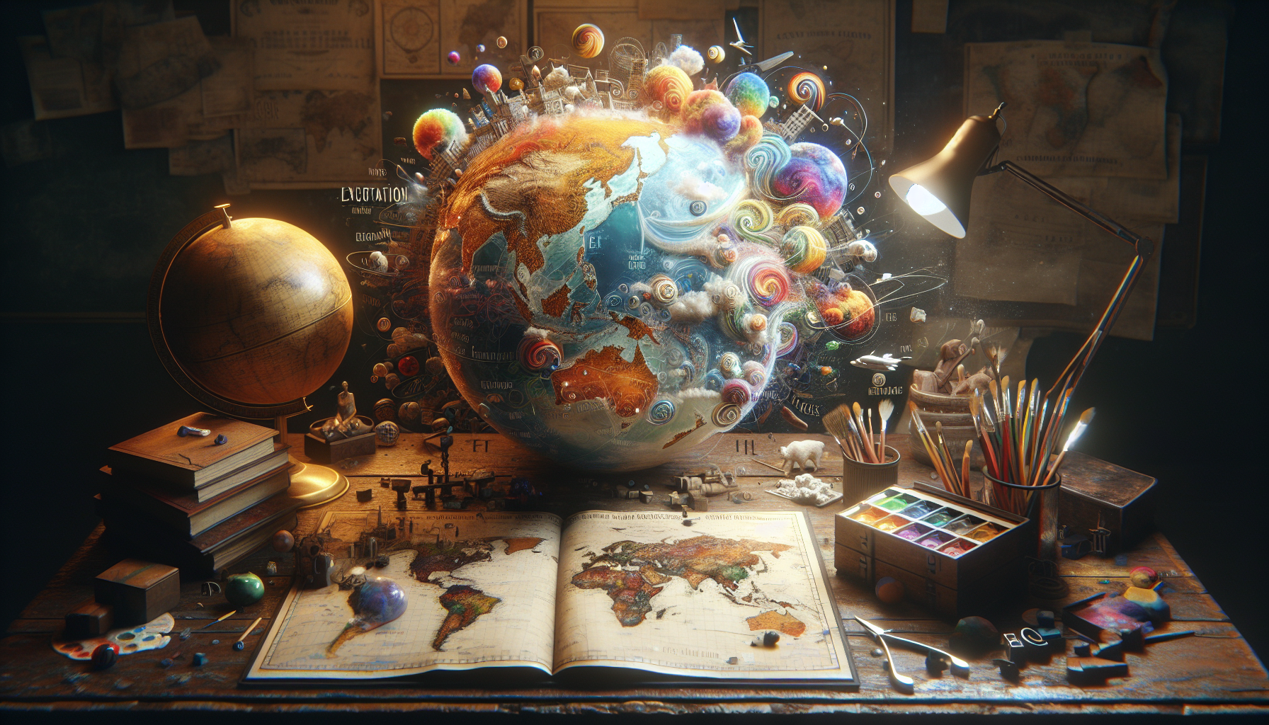
In the age of digital navigation and GPS, the art and science of cartography might seem like a relic of the past, a quaint discipline overshadowed by satellites and algorithms. Yet, maps remain an intrinsic part of our lives, shaping not only our understanding of geography but also influencing our perception of the world in subtle, often deceptive ways. Welcome to the intriguing realm of “Map Mastery: Uncovering Deceptive Cartography That Defies Convention to Educate and Confuse.” This exploration delves into the captivating duality of maps—tools of enlightenment and instruments of obfuscation. 🌍
Maps are more than mere representations of physical spaces; they are powerful narratives that have historically been used to educate, mislead, and manipulate. From ancient times to the modern era, cartographers have employed creative liberties to emphasize or diminish features, cater to specific agendas, or even inspire wonder and exploration. In this article, we will journey through the annals of cartographic history, revealing how maps have been employed as both tools of knowledge and instruments of deceit. We will examine infamous examples of cartographic trickery and uncover the motivations behind these artistic choices. The Mercator projection, for instance, is a classic case of how distortion can influence perception, exaggerating the size of territories near the poles and diminishing those near the equator, thus subtly skewing our view of the world.
As we delve deeper, this article will illuminate the fine line between creative cartography and deceptive mapping. We will explore how maps have been used in propaganda, colonial endeavors, and even modern media to convey specific messages or ideologies. Additionally, we will discuss the ethical implications and responsibilities of mapmakers in an era where misinformation can spread as rapidly as truth. By the end of this exploration, readers will gain a newfound appreciation for the artistry and complexity of maps, as well as a critical eye for discerning the truth hidden beneath their colorful surfaces. Join us on this voyage of discovery, where the landscapes of cartography reveal themselves not just as reflections of the physical world, but as complex tapestries woven with intent and ingenuity. 🗺️
The Art of Deceptive Cartography: An Overview
Cartography, the art and science of making maps, has long been a tool for navigation, education, and understanding our world. However, maps can also serve as instruments of persuasion, manipulation, and deception. This dual nature of maps makes them uniquely powerful yet potentially misleading. In this section, we delve into how maps can both educate and confuse through their design and presentation.
Maps are inherently subjective, as they are a representation of reality rather than reality itself. The choices cartographers make—such as what to include or exclude, the colors and symbols used, and the scale of the map—can significantly influence the viewer’s perception. For instance, a map that uses bright colors to highlight certain areas can draw attention away from other parts, subtly guiding the viewer’s focus. Similarly, the choice of projection can distort the size and shape of landmasses, which can lead to misconceptions about the relative size and importance of different regions.
The history of cartography is filled with examples of maps used for political or ideological purposes. During the Cold War, both the United States and the Soviet Union created maps that exaggerated the size of their respective territories to convey power and dominance. Such maps, while visually striking, often distort reality to serve a particular agenda. This illustrates how maps can be used to manipulate perceptions, emphasizing certain aspects while downplaying others. As we explore further, it becomes clear that understanding these nuances is crucial for interpreting maps critically and discerning their true intent.
Techniques of Deception in Cartography
To truly appreciate the deceptive potential of maps, one must understand the various techniques cartographers use to manipulate perceptions. One common method is through the use of different map projections. The Mercator projection, for example, is famous for distorting the size of landmasses near the poles, making regions like Greenland appear much larger than they actually are. While useful for navigation due to its angle-preserving properties, the Mercator projection can give a skewed sense of the world, potentially leading viewers to overestimate the importance of certain regions.
Another technique involves the selective inclusion or exclusion of information. Maps that highlight specific data points, such as economic indicators or population density, can paint vastly different pictures depending on what is emphasized. For instance, a map that highlights GDP per capita might depict wealthier nations as more prominent, whereas a map focusing on total GDP could give a different impression. These choices can subtly guide the viewer’s understanding of global or regional dynamics, emphasizing some narratives while obscuring others.
Color and symbolism also play a crucial role in how maps communicate information. Bright, contrasting colors can draw attention and suggest importance, while muted tones may imply insignificance. Symbols, such as stars for capitals or arrows for migration paths, can add layers of meaning and interpretation. These visual elements, when used strategically, can reinforce particular messages or biases embedded within the map. The challenge for the viewer is to recognize these elements and question their impact on the map’s message.
Comparative Analysis of Map Projections
| Projection | Strengths | Weaknesses |
|---|---|---|
| Mercator | Preserves angles, useful for navigation | Distorts size, especially near poles |
| Robinson | Balances size and shape distortions | Compromises accuracy in both aspects |
| Gall-Peters | Preserves area, emphasizes size accuracy | Distorts shape, particularly of continents |
Check out the table above for a comparative analysis of popular map projections. Each projection serves different purposes and highlights different aspects of the world, showcasing the complex interplay between utility and distortion in cartographic design.
The Impact of Deceptive Cartography on Public Perception
Maps are powerful tools that can shape public perception and influence decision-making on a grand scale. When used deceptively, they can reinforce stereotypes, bolster propaganda, or skew public understanding of geographical realities. For instance, political maps that favor certain countries or regions can promote nationalistic sentiments, while maps emphasizing particular resources or industries can influence economic and environmental policies.
Consider the use of thematic maps in media and education. These maps often aim to illustrate complex data in a visually accessible manner. However, when data is selectively presented or exaggerated, it can lead to misconceptions. A map showing crime rates, for example, might highlight certain neighborhoods, creating a perception of danger that may not align with reality. Similarly, maps depicting electoral outcomes can be designed to emphasize victories or downplay losses, affecting public opinion and political discourse.
In the digital age, interactive maps offer new dimensions of engagement but also pose challenges. While they provide users with the ability to explore data dynamically, they can also be manipulated to present biased views. The choices of what data to include, how it is visualized, and the narrative that accompanies the map all contribute to its impact. As such, developing critical map-reading skills is essential for navigating the complex landscape of modern cartography.
Educational Videos on Cartography
For a deeper understanding of how cartography can deceive and inform, consider watching the following video: “The Power of Maps: How They Manipulate Your Mind” by Geography Now. This video explores the intricate ways maps can influence perceptions and offers insights into becoming a more discerning map reader.
Embracing Cartographic Literacy in the Modern World
In a world inundated with information, developing cartographic literacy is more important than ever. Understanding how maps can deceive or enlighten is crucial for anyone seeking to navigate the complexities of global issues. By recognizing the elements of map design and the intent behind them, individuals can become more informed and critical consumers of cartographic information.
- Explore different map projections to understand their strengths and weaknesses.
- Question the data and narratives presented in thematic maps.
- Engage with interactive maps to explore multiple perspectives.
- Educate others about the power and pitfalls of cartography.
By adopting these practices, we can better appreciate the art of cartography while remaining critical of its potential to deceive. As we continue to explore the intricate world of maps, let us remain curious, informed, and ever vigilant against the subtle forces of manipulation that lie within their folds.
উপসংহার
Conclusion: Mastering the Map: Navigating the Intricacies of Deceptive Cartography
In our exploration of “Map Mastery: Uncovering Deceptive Cartography That Defies Convention to Educate and Confuse,” we have journeyed through the fascinating world of maps that are intentionally crafted to challenge our perceptions, provoke critical thinking, and sometimes lead us astray. This multifaceted approach to cartography serves as both an educational tool and a medium for deception, highlighting the dual nature of maps as instruments of knowledge and, occasionally, manipulation.
At the heart of our discussion was the recognition that maps are not merely passive reflections of the world but active agents in shaping our understanding of it. From historical examples to contemporary cases, we examined how maps have been used to wield power, influence political boundaries, and reflect cultural biases. This underscores the importance of developing a critical eye when interpreting maps, understanding that every choice a cartographer makes—be it in scale, projection, or design—carries with it an inherent bias or purpose.
We delved into the various techniques employed in deceptive cartography, such as selective inclusion or exclusion of data, exaggerated symbolism, and creative projection methods. These techniques, while sometimes used to mislead, can also serve educational purposes. For instance, by intentionally distorting familiar geographies, cartographers can draw attention to aspects of the world that might otherwise be overlooked, encouraging viewers to question their assumptions and engage more deeply with the information presented.
The discussion also highlighted the ethical considerations surrounding the use of deceptive maps. While some maps are designed to educate and inform, others can be utilized to mislead the public or perpetuate misinformation. This duality presents a challenge to both mapmakers and map users, emphasizing the need for transparency and critical literacy in the consumption of cartographic information.
Moreover, we explored how digital advancements and the rise of interactive mapping technologies have transformed the landscape of cartography. These tools have democratized map-making, allowing individuals and communities to create and share their own maps. However, they also pose new challenges in verifying the accuracy and intent behind the maps we encounter online.
The significance of this topic extends beyond academic interest; it has practical implications for how we navigate and understand the world. As global citizens, it is crucial to cultivate map literacy—an awareness of the persuasive power of maps and the skills to discern their intentions. This literacy empowers individuals to make informed decisions based on geographic data, whether it relates to political developments, environmental changes, or social movements.
In light of these discussions, the importance of fostering a culture of critical engagement with maps becomes evident. By questioning the conventional narratives often embedded within cartographic representations, we can better appreciate the complexity of the world and the diverse perspectives that shape it. This not only enriches our understanding but also encourages a more inclusive approach to geography and global issues.
As we conclude, we invite you, dear reader, to reflect on the maps you encounter in your daily life. Consider how they influence your perception of the world and the narratives they may perpetuate. Engage with maps critically, question their origins and purposes, and explore alternative perspectives they might not immediately reveal.
Furthermore, we encourage you to share this newfound awareness with others. Discuss with friends and colleagues the role of maps in shaping our understanding of global issues. Share this article with your network to spark meaningful conversations about the power and potential pitfalls of cartography. 🌍
For further reading on the subject, you might find these resources insightful:
– The Power of Maps in Modern Society
– Understanding Cartographic Manipulation
Thank you for joining us on this journey through the intriguing world of deceptive cartography. We hope it has ignited your curiosity and inspired you to see maps—and the world—in a new light. 📍
টনি সান্তোস একজন ডিজিটাল মানচিত্রকার, ভিজ্যুয়াল চিন্তাবিদ এবং আশ্চর্যজনকভাবে অদ্ভুতের কিউরেটর। এ Aysapp সম্পর্কে, সে বন্য জগতে ডুব দেয় অদ্ভুত মানচিত্র, কাল্পনিক ভৌগোলিক অঞ্চল এবং বিকল্প মানচিত্রাঙ্কন বাস্তবতা, আমাদের চারপাশের জগৎকে আমরা কীভাবে দেখি - এবং অনুভব করি - তার উপর একটি নতুন দৃষ্টিভঙ্গি প্রদান করে।
তার কাজ এই বিশ্বাসের উপর প্রতিষ্ঠিত যে মানচিত্র কেবল নেভিগেশন সরঞ্জামের চেয়েও বেশি কিছু।. এগুলো হলো উপলব্ধি, স্মৃতি, কল্পনা, এমনকি মিথের দ্বার। বিকৃত ঐতিহাসিক চার্ট থেকে শুরু করে পরাবাস্তব ভূমিরূপ, ষড়যন্ত্রের অ্যাটলেস এবং কৃত্রিম বুদ্ধিমত্তা-সৃষ্ট বিশ্ব নির্মাণ, টনি এমন মানচিত্র তৈরি এবং সংগ্রহ করে যা যুক্তিকে চ্যালেঞ্জ করে এবং কৌতূহল জাগায়.
গল্প বলা, শিল্প এবং প্রতীকী অন্বেষণের পটভূমির অধিকারী, টনি আইস্যাপকে একটি প্ল্যাটফর্ম হিসেবে ব্যবহার করে প্রকাশ করার জন্য ভুলে যাওয়া জায়গা, অদৃশ্য সীমানা, আর নতুন করে কল্পনা করা বাস্তবতা. তার সৃষ্টিগুলো এমন প্রশ্ন করে: যদি পৃথিবী উল্টে যেত? যদি মানচিত্রে ভৌগোলিক সত্যের পরিবর্তে আবেগগত সত্য বলা হত?
পিছনে স্রষ্টা হিসেবে Aysapp সম্পর্কে, সে একটা মিশনে আছে যে কৌতূহল জাগানো, সৃজনশীল চিন্তাভাবনাকে উৎসাহিত করুন, এবং কল্পনা, সংস্কৃতি এবং স্থানিক গল্প বলার মধ্যে ছেদ অন্বেষণ করুন — একের পর এক অদ্ভুত মানচিত্র।
🌀 তার মানচিত্রাঙ্কন জগৎ অন্বেষণ করে:
-
অবাস্তব কিন্তু অর্থপূর্ণ প্রাকৃতিক দৃশ্য
-
ভূগোল হিসেবে আবেগ, স্মৃতি এবং মিথ
-
লুকানো সত্য প্রকাশের জন্য বিকৃত মানচিত্র
আপনি যদি কল্পনাপ্রসূত ভূমির ভক্ত হন, মানচিত্র সংগ্রাহক হন, কৌতূহলী ভ্রমণকারী হন, অথবা অস্বাভাবিক কিছু ভালোবাসেন এমন কেউ হন, টনি তোমাকে ইচ্ছাকৃতভাবে মানচিত্রাঙ্কন কল্পনার সবচেয়ে অসাধারণ কোণে হারিয়ে যেতে আমন্ত্রণ জানাচ্ছে।