Hirdetések
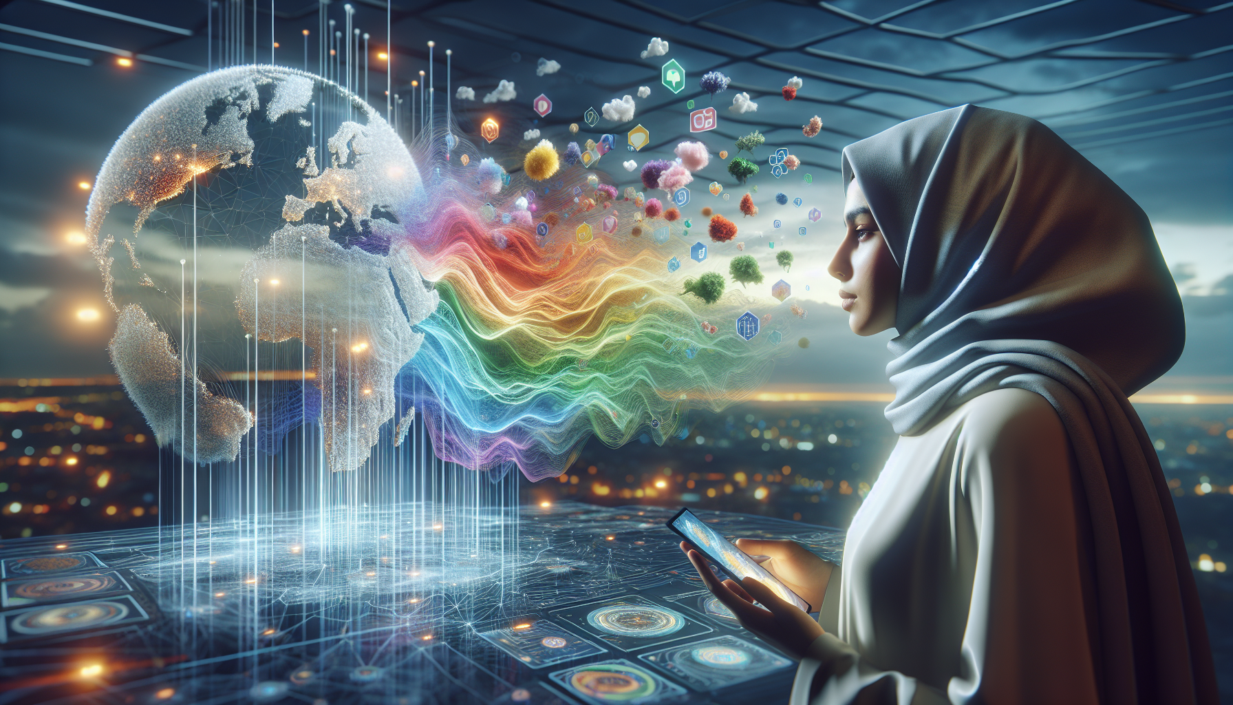
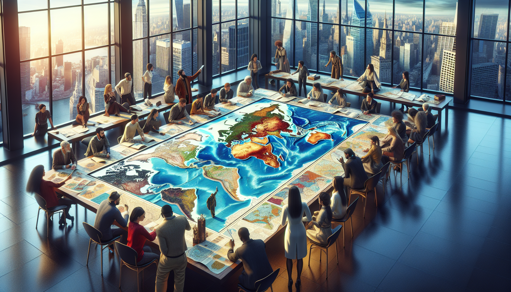
In a world where information is at our fingertips and global connections are just a click away, the way we perceive the world around us has become more complex and fascinating than ever. Yet, amidst this digital revolution, one ancient tool continues to reshape our understanding of the world: the map. These seemingly simple pieces of paper or pixels are far more than mere navigational aids; they are powerful instruments that influence how we see ourselves and others. With every line, curve, and contour, maps hold the ability to alter perceptions, challenge assumptions, and ignite curiosity. In this exploration of cartographic wonders, we invite you to discover the power of perspective and delve into how various maps shift your perception of the world. 🌍
Hirdetések
At first glance, a map might seem like a straightforward representation of geography, a static image of continents and oceans. However, every map is an interpretation, a lens through which we view the complex tapestry of our planet. From the familiar Mercator projection, which distorts size to preserve shape, to the lesser-known Peters projection, which offers a more proportionate view of landmasses, each map tells its own story. In this article, we will unravel the mysteries behind these projections and explore how they influence our understanding of space, politics, and culture. We will journey through time, examining historical maps that reveal how perceptions have evolved, and venture into the realm of modern technology, where interactive maps redefine our engagement with the world.
Hirdetések
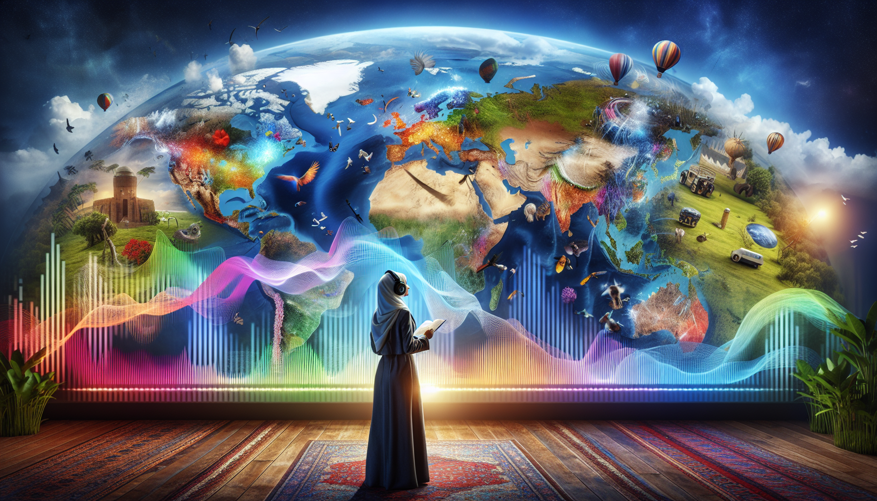
As we embark on this cartographic journey, we will encounter maps that challenge our notions of north and south, redraw borders in our minds, and even map the intangible, such as emotions or internet connectivity. By examining how maps can manipulate data, emphasize particular narratives, and sometimes mislead, we will uncover the subtle power they wield in shaping our worldview. Whether you are a seasoned traveler, a curious learner, or simply someone intrigued by the art of mapmaking, this exploration promises to illuminate the unseen forces that guide our perceptions. So, open your mind, prepare to see the world anew, and let us navigate the transformative terrain of maps together. 🗺️
The Mercator Projection: A New Perspective on Navigation
The Mercator projection is perhaps one of the most well-known map projections in the world. Developed by Gerardus Mercator in 1569, this cylindrical map projection revolutionized navigation. Its primary goal was to facilitate sea travel by representing lines of constant course, known as rhumb lines, as straight segments. This feature proved invaluable to navigators during the Age of Exploration, making the Mercator projection a staple in maritime charts.
One of the key characteristics of the Mercator projection is its ability to preserve angles and shapes over small areas, which is crucial for accurate navigation. However, this comes at a cost. The projection distorts the size of landmasses, particularly as one moves away from the equator. For example, Greenland appears much larger than it actually is when compared to Africa, despite the fact that Africa’s land area is approximately 14 times greater. This distortion has significant implications for how we perceive the world and the relative importance of various regions.
The influence of the Mercator projection extends beyond navigation. It has shaped our understanding of geography, politics, and global power dynamics. By exaggerating the size of regions closer to the poles, it inadvertently suggests a skewed perception of importance and dominance. This has led to criticisms and calls for alternative projections that provide a more balanced view of the world. To better understand these dynamics, explore the video titled “The Mercator Projection – Great for Sailors, Bad for Geographic Understanding” on the Vox channel.
Comparing Different Map Projections
When it comes to representing the Earth’s surface, no single map projection is perfect. Each one has its advantages and trade-offs, and understanding these can shift our perception of the world. Below is a comparison of some popular map projections and their characteristics.
| Vetítés | Strengths | Weaknesses |
|---|---|---|
| Mercator | Preserves angles, good for navigation | Distorts size, especially near poles |
| Robinson | Balances size and shape, aesthetically pleasing | Compromises accuracy in both aspects |
| Gall-Peters | Preserves area, emphasizes equality | Distorts shape, especially at the equator |
Review the table above to see how different projections offer varying perspectives of the world. Each choice reflects specific priorities, whether they be navigational precision, visual appeal, or a focus on area accuracy. Understanding these differences can deepen our appreciation of the complexities involved in map-making.
The Robinson Projection: Striking a Balance
The Robinson projection was created by Arthur H. Robinson in 1963 in response to the shortcomings of the Mercator projection. It aims to create a more visually appealing representation of the world by striking a balance between preserving size and shape. The result is a map that, while not perfect in any one aspect, offers a more equitable view of the world’s geography.
This projection gained popularity for its ability to reduce distortion in the high latitudes, providing a more accurate depiction of landmasses like Russia and Canada without inflating their size as seen in the Mercator. Its use in educational settings and world maps further attests to its effectiveness in offering a more comprehensive view of the globe. However, it sacrifices some navigational precision in the process.
The Robinson projection’s design reflects an understanding that map viewers often prioritize an aesthetically pleasing and informative depiction over strict navigational accuracy. By examining the benefits and limitations of this projection, we gain insights into how maps can shape our perception of the world. For a deeper dive into the visual appeal of map projections, watch “Map Projections: A Comprehensive Overview” on the Geography Now channel.
The Gall-Peters Projection: A Focus on Equality
Introduced by James Gall and popularized by Arno Peters, the Gall-Peters projection challenges traditional perceptions by focusing on area accuracy. Unlike the Mercator projection, it presents landmasses in their true proportions relative to one another. This approach emphasizes the equitable representation of countries, highlighting the often-overlooked importance of regions in the Global South.
Despite its emphasis on area accuracy, the Gall-Peters projection is not without its critics. By preserving area, it distorts shapes, making continents appear stretched, especially near the equator. This distortion can make it difficult for viewers to recognize familiar landmasses, leading to debates about its effectiveness as a tool for visual communication.
Nevertheless, the Gall-Peters projection plays a vital role in reshaping how we view the world. It encourages us to question the biases inherent in traditional maps and consider alternative perspectives. By focusing on equality, it challenges viewers to re-evaluate assumptions about the significance and size of different regions. For an engaging discussion on the importance of the Gall-Peters projection, check out “Why all world maps are wrong” on the Vox channel.
Exploring Other Unique Map Projections
While the Mercator, Robinson, and Gall-Peters projections are among the most well-known, there are many other unique projections that offer different perspectives on the world. These maps serve various purposes, from scientific analysis to artistic expression, and each provides a unique lens through which to view the Earth’s surface.
One such projection is the Winkel Tripel, used by the National Geographic Society for its world maps. It aims to minimize distortion of area, direction, and distance, creating a more balanced view of the world. Its name, derived from the German word for “triple,” reflects its attempt to strike a balance between these three elements. This projection is often praised for its visual appeal and accuracy, making it a popular choice for educational purposes.
Another intriguing projection is the Dymaxion map, designed by architect and inventor Buckminster Fuller. This projection unfolds the Earth onto the surface of an icosahedron, preserving shapes and relative sizes of landmasses without splitting continents. The Dymaxion map is notable for its ability to present a more connected view of the world’s oceans and continents, encouraging viewers to rethink geographical relationships and the interconnectedness of the global community. To explore this unique projection, watch “The Dymaxion Map: Rethinking the World” on the CGP Grey channel.
These alternative projections demonstrate the diversity and creativity inherent in map-making. Each offers a unique perspective that challenges conventional views and encourages us to explore the world through different lenses. By understanding the strengths and weaknesses of various map projections, we can appreciate the complexity and artistry involved in representing the Earth’s surface.
Következtetés
In exploring the power of perspective through various maps, we have journeyed through the intricate ways that cartography shapes our understanding of the world. Maps, often perceived as mere tools for navigation, hold a profound capacity to influence our perceptions, challenge our preconceptions, and ignite curiosity about the world around us. This article has delved into the different types of maps and how they serve as powerful instruments in expanding our worldviews.
We began by examining the historical evolution of maps and how early cartographers like Ptolemy and Mercator shaped geographical understanding. These pioneers laid the foundation for modern cartography, providing a lens through which people could perceive their place in the world. From ancient maps that depicted mythical creatures to the detailed satellite imagery we rely on today, the journey of maps is a testament to human curiosity and our relentless pursuit of knowledge.
Next, we explored various types of maps—political, physical, topographic, and thematic—and their distinct purposes. Each type of map presents a unique perspective, highlighting different aspects of our planet. Political maps delineate boundaries and foster an understanding of geopolitical landscapes. Physical maps reveal the natural features of the earth, such as mountains and rivers, offering insights into the planet’s physicality. Topographic maps add depth to our perception by illustrating elevation and terrain, while thematic maps provide targeted information on specific topics like population density or climate patterns.
A key highlight of our exploration was the concept of map projections and their inherent distortions. Understanding projections like the Mercator, Peters, and Robinson allows us to critically evaluate the maps we encounter daily. Each projection presents a trade-off between accuracy and utility, reminding us that no map can perfectly encapsulate the complexity of our world. Recognizing these limitations empowers us to approach maps with a critical eye, acknowledging their influence on our understanding of global geography.
Furthermore, we discussed the transformative role of digital maps and geographic information systems (GIS) in modern cartography. Technology has democratized access to mapping tools, enabling individuals to create and share maps with unprecedented ease. This democratization has expanded the horizons of cartography, fostering a more inclusive understanding of geography that embraces diverse perspectives.
In reflecting on the power of perspective, it is crucial to acknowledge how maps influence societal narratives and cultural identities. They can reinforce stereotypes or challenge preconceived notions, serving as a mirror to our biases and beliefs. Maps are not merely representations of physical space; they are narratives that convey stories of power, exploration, and discovery. By engaging with maps critically, we can become more aware of the world’s complexity and the multitude of perspectives that exist within it.
The exploration of maps also invites us to appreciate the beauty and artistry involved in their creation. From the intricate hand-drawn maps of the past to the sophisticated digital renderings of today, cartography is a blend of science and art. This artistic element enriches our experience of maps, encouraging us to see them not just as tools, but as works of art that inspire wonder and curiosity.
As we conclude this exploration, it is important to recognize the broader implications of understanding maps. By appreciating the diverse ways maps can represent the world, we open ourselves to a more nuanced perspective that transcends borders and fosters global understanding. Maps encourage us to think critically, question assumptions, and embrace the rich tapestry of human experience.
In a world that is increasingly interconnected, the ability to interpret and understand maps is a vital skill. Maps are more than navigational aids; they are gateways to knowledge, empathy, and awareness. By engaging with maps thoughtfully, we can better navigate the complexities of our world and contribute to a more informed and compassionate global community.
We encourage you, dear reader, to apply what you have learned about the power of perspective in your daily life. Whether you are planning a journey, studying global issues, or simply exploring your surroundings, let the insights gained from this exploration guide you. Share this knowledge with others, spark conversations, and inspire curiosity. In doing so, you contribute to a world where diverse perspectives are celebrated and understood.
Let us embrace the power of maps to not only guide our travels but to enrich our understanding of the world and each other. 🌍✨
For further reading and exploration on this fascinating topic, consider these resources:
– National Geographic’s Guide to Map Projections [National Geographic](https://www.nationalgeographic.com/maps)
– The International Cartographic Association’s Resources on Cartography [ICA](https://icaci.org/)
– ESRI’s Insights on GIS Technology [ESRI](https://www.esri.com/en-us/home)
Thank you for joining us on this journey through the world of maps. We hope you feel inspired to explore, question, and appreciate the power of perspective.
Toni Santos digitális térképész, vizuális gondolkodó és a csodálatosan furcsaságok kurátora. at Aysapp, belemerül a vad világába bizarr térképek, elképzelt földrajzi területek és alternatív térképészeti valóságok, amely új perspektívát kínál arra vonatkozóan, hogyan látjuk – és érezzük – a körülöttünk lévő világot.
Munkássága abban a hitben gyökerezik A térképek többet jelentenek, mint navigációs eszközök. Ezek az észlelés, az emlékezet, a képzelet, sőt a mítosz portáljai. A torz történelmi térképektől a szürreális felszínformákig, az összeesküvés atlaszokig és a mesterséges intelligencia által generált világépítésig, Toni olyan térképeket készít és gyűjt, amelyek megkérdőjelezik a logikát és felkeltik a kíváncsiságot.
A történetmesélés, a művészet és a szimbolikus felfedezés terén szerzett háttérrel rendelkező Toni az Aysappot használja platformként, hogy felfedje. elfeledett helyek, láthatatlan határok és újragondolt valóságok. Alkotásai olyan kérdéseket tesznek fel, mint: Mi lenne, ha a világ fejjel lefelé fordulna? Mi lenne, ha a térképek érzelmi igazságokat mondanának el földrajziak helyett?
Mint a mögötte álló alkotó Aysapp, küldetése van kíváncsiságot keltenek, ösztönözze a kreatív gondolkodást, és fedezze fel a képzelet, a kultúra és a térbeli történetmesélés metszéspontját – egy-egy furcsa térképet.
🌀 A térképészeti univerzum a következőket kutatja:
-
Irreális, de tartalmas tájak
-
Érzelem, emlékezés és mítosz mint földrajz
-
Térképek, amelyek eltorzítják a rejtett igazságokat
Legyen szó fantáziaföldek rajongójáról, térképgyűjtőről, kíváncsi utazóról vagy valakiről, aki szereti a szokatlant, Toni arra hív, hogy eltévedj – szándékosan – a térképészeti képzelet legkülönlegesebb zugaiban.