Iklan
When you glance at a world map, what do you see? Majestic continents sprawling across vast oceans, familiar shapes of countries etched into your mind since childhood. But have you ever paused to question the accuracy of these representations? Specifically, how accurate is the portrayal of Greenland and Africa on these maps? 🤔 The tale of these landmasses on the Mercator projection is more than just cartographical curiosity—it’s a compelling narrative of perception versus reality, a story that challenges the way we see our world and perhaps, how we understand truth itself.
Iklan
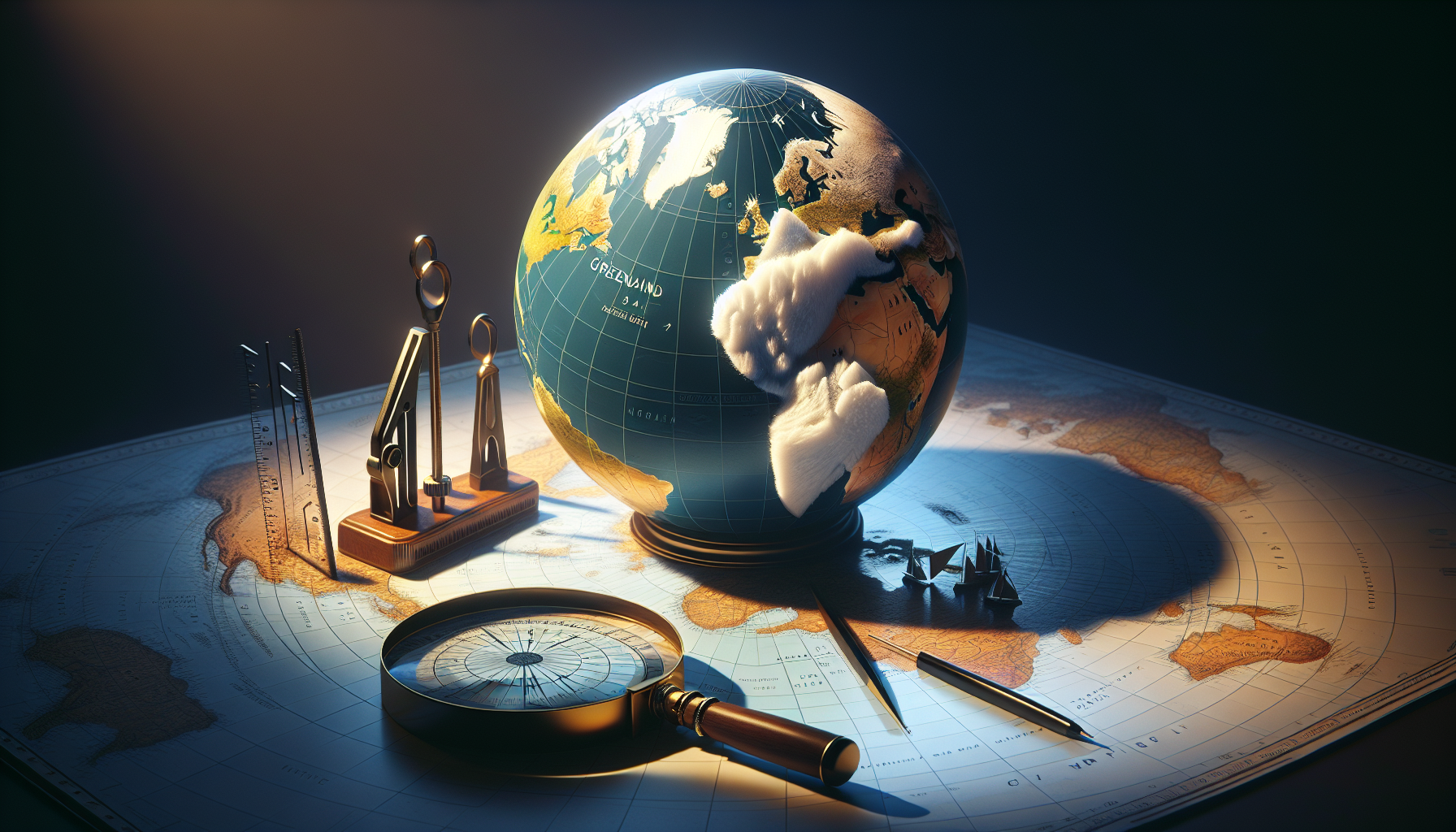
For centuries, the Mercator projection has been a trusty tool in the navigator’s toolkit, lauded for its ability to represent courses of constant bearing as straight lines. This quality made it invaluable for maritime navigation, a purpose it serves admirably to this day. However, the map comes with its own set of distortions, particularly as you move away from the equator. Greenland, for instance, looms as a massive icy territory, appearing almost the same size as the entire African continent. Yet, in reality, Africa is over 14 times larger than Greenland. This staggering discrepancy poses intriguing questions: How did this map come to be, and why has it persisted for so long in educational systems and media around the globe? 🌍
Iklan
The journey to uncover the truth behind the Mercator deception involves delving into the history of map-making, understanding the scientific principles behind different types of projections, and exploring the cultural and political influences that have allowed this particular representation to endure. We will unravel the historical context in which Gerardus Mercator crafted his map, initially designed for specific practical use but eventually gaining an almost ubiquitous presence in classrooms worldwide. This exploration will reveal not just technical insights but also the impact of colonial and Eurocentric perspectives in shaping our world view.
Moreover, this article will venture into the implications of these distortions. How do these skewed perceptions influence our understanding of global geography, power dynamics, and socio-economic issues? Maps are more than mere navigational tools—they are instruments of information and ideology. The way they present information can influence our perception of importance and relevance. By presenting Africa as smaller, do we subconsciously attribute less significance to its issues and potential? The psychological and educational ramifications are profound and merit thorough examination.
Finally, we will look at the modern efforts to present a more accurate portrayal of our world. From innovative mapping technologies to educational reforms, the quest for truth in cartography is a testament to our collective desire to see the world as it truly is, unfiltered by the lenses of outdated perspectives. This narrative invites readers to question what they know and encourages an openness to new understandings. So, join us as we embark on a journey to unveil the Mercator deception, a journey that promises to enlighten, challenge, and perhaps, transform your perspective on the world map as you know it. 📜✨
Introduction to the Mercator Projection
The Mercator projection is one of the most widely used map projections in the world, celebrated for its ability to represent lines of constant course. Originally developed by the Flemish cartographer Gerardus Mercator in 1569, this cylindrical map projection revolutionized navigation. However, it comes with significant distortions, particularly in the size and shape of landmasses. One of the most intriguing misconceptions it perpetuates is the size comparison between Greenland and Africa. This article delves into this deception, unveiling the truth behind the illusions created by the Mercator projection.
The beauty of the Mercator projection lies in its unique ability to represent direction accurately, which is crucial for maritime navigation. This accuracy is achieved by preserving angles, a feature known as conformality. However, this comes at a cost: the size distortion increases with latitude. This means that the further from the equator a landmass is, the larger it appears. As such, regions like Greenland, situated near the poles, appear disproportionately large compared to equatorial regions like Africa.
The choice of projection depends on the purpose of the map. For navigational charts, the Mercator projection is ideal. However, for educational and reference purposes, it can mislead viewers about the actual sizes of continents and countries. This brings us to the central theme of our article: the deceptive size illusion of Greenland compared to Africa, as perpetuated by the Mercator projection. 🌍
Greenland vs. Africa: The Distorted Reality
On a typical Mercator map, Greenland appears almost as large as Africa. This is misleading since Africa is, in reality, about 14 times larger than Greenland. The distortion is a result of how the Mercator projection expands areas as they move away from the equator. This section of the article aims to dissect this illusion and provide a more accurate perspective of the actual sizes.
To put it in numbers, Greenland covers an area of approximately 2.17 million square kilometers, while Africa spans about 30.37 million square kilometers. This vast discrepancy is not evident on the Mercator map, which is why a critical examination is necessary. By presenting an accurate depiction of these landmasses, we can better understand the implications of using such a projection in educational contexts.
The table below illustrates a comparison between the actual and perceived sizes of Greenland and Africa as seen on a Mercator map. By comparing these figures, we aim to bring clarity to this common cartographic misconception.
| Region | Actual Size (Million sq km) | Perceived Size on Mercator Map |
|---|---|---|
| Greenland | 2.17 | Similar to Africa |
| Africa | 30.37 | Similar to Greenland |
For a visual breakdown of this distortion, watch the video titled “Why All World Maps Are Wrong” on the Vox channel. 📺
The Historical Context and Implications
Understanding the history and implications of the Mercator projection is crucial in comprehending why this map became so widespread despite its inaccuracies. Historically, the Mercator projection was developed during the Age of Exploration, a time when maritime navigation was paramount. Its ability to depict true courses made it invaluable to explorers. However, the over-reliance on this projection has perpetuated geographical misconceptions that persist to this day.
The educational implications are significant. When students view maps that inaccurately portray the size of countries and continents, their understanding of geography is skewed. This can affect their worldview, influencing perceptions about the importance or dominance of different regions. As educators and communicators, it’s essential to address these inaccuracies by incorporating alternative projections and resources into curricula.
The Peters projection, for instance, is an alternative that presents landmasses in their true size relative to each other, offering a more accurate representation. While it sacrifices the angle accuracy of the Mercator projection, it provides a valuable perspective that can complement traditional maps.
The Impact on Geopolitical Perceptions
Map projections are more than just educational tools; they shape our perception of the world. The distortions of the Mercator map have had unintended geopolitical impacts, influencing how countries perceive their place in the world. Larger depictions can imply dominance, whereas smaller representations might suggest inferiority. Understanding these implications can lead to more informed discussions about global politics and relations.
By acknowledging these biases, we can foster a more balanced and equitable understanding of global geography. Encouraging the use of various map projections in media and education can help mitigate these effects, providing a more nuanced view of our world.
Here’s a quick list of key takeaways regarding map projections and their implications:
- The Mercator projection distorts size, particularly at higher latitudes.
- Africa is 14 times larger than Greenland, contrary to Mercator representations.
- Alternative projections, like Peters, offer more accurate size comparisons.
- Geopolitical perceptions can be influenced by map distortions.
Conclusion: Embracing a New Perspective
The Mercator projection, while revolutionary for navigation, has perpetuated significant misconceptions regarding the sizes of continents and countries. By understanding these distortions, we can better appreciate the complexities of map-making and the importance of using multiple projections for different purposes.
As technology advances and new mapping techniques become available, it is crucial to revisit our understanding of global geography. By embracing a diverse range of map projections, we can offer a more accurate and comprehensive view of our world, fostering a deeper understanding and appreciation for the diversity of our planet.
Stay informed and explore alternative perspectives in geography by engaging with educational content online. For a more visual understanding, watch the video “The Mercator Projection” on the Geography Now channel, which provides an in-depth look at these cartographic challenges. 📚
Kesimpulan
In conclusion, “Unveiling The Mercator Deception: Exposing the Truth Behind Greenland’s Size Illusion Compared to Africa” has taken us on an enlightening journey through the fascinating and often misunderstood world of cartography. Throughout this article, we have delved into the historical development of the Mercator projection, a map design introduced by Gerardus Mercator in 1569, which has become the most widely used map projection to this day. Its primary utility in navigation, due to its ability to represent lines of constant course as straight segments, has cemented its place in maritime history and education. However, its limitations in accurately portraying the true size and proportion of landmasses have long been a subject of critique and intrigue.
One of the most striking examples of these distortions is the portrayal of Greenland and Africa. On the Mercator map, Greenland often appears comparable in size to Africa, when in reality, Africa’s landmass is about 14 times larger. This misrepresentation is due to the projection’s tendency to exaggerate the size of regions as they move away from the equator. This geographic deception has significant implications, not only in geography and education but also in how we perceive the world politically and culturally. It can skew our understanding of the size, importance, and influence of different regions, subtly reinforcing certain biases and worldviews.
The exploration of alternative map projections, such as the Gall-Peters projection, offers a more accurate representation of the world’s landmasses by maintaining area proportionality. Despite the distortions in shape that these alternatives may introduce, they serve as crucial tools in promoting a more balanced and equitable view of the world. By juxtaposing these different projections, we gain a fuller appreciation of the complexity involved in mapmaking and the importance of choosing the right projection based on the map’s intended use.
Our discussion has underscored the critical role maps play not only as tools for navigation but also as instruments of power and influence. Maps are far from neutral; they are imbued with the intentions and perspectives of their creators. As such, they have the potential to shape our understanding of geopolitical landscapes and cultural narratives. Recognizing the limitations and biases inherent in any map projection empowers us to question and challenge our assumptions, fostering a more nuanced and informed view of the world.
The significance of this topic extends beyond the realm of geography. In an increasingly interconnected world, where global awareness and cultural sensitivity are paramount, understanding the limitations of traditional map projections encourages us to approach global issues with greater empathy and insight. By acknowledging and addressing these cartographic distortions, we contribute to a more accurate and inclusive global narrative, one that respects the diversity and richness of our planet’s cultures and environments.
As we reflect on the insights gained from this exploration, I encourage you to engage with this topic further. Share your thoughts and experiences in the comments below, and consider how the information presented here might influence your perspective on global geography and cultural dynamics. You can also explore additional resources and interactive maps that provide alternative views of the world, challenging you to see familiar places in a new light.
Here are some resources to continue your journey of discovery:
– The True Size Of: An interactive tool that allows you to compare the size of different countries and continents by dragging and dropping them on a map.
– National Geographic: Map Projections: An informative article exploring various map projections and their uses.
– The Gall-Peters Projection: More about the Gall-Peters projection and its significance.
In closing, maps are not just representations of geographical spaces; they are reflections of our worldviews and cultural perceptions. By critically examining and embracing diverse perspectives, we pave the way for a more inclusive and understanding global community. Let us continue to question, learn, and share, ensuring that our collective map of knowledge is as accurate and equitable as possible. 🌍
Toni Santos adalah seorang kartografer digital, pemikir visual, dan kurator hal-hal aneh yang menakjubkan. Pada Aysapp, dia menyelami dunia liar peta aneh, geografi imajiner, dan realitas kartografi alternatif, menawarkan perspektif baru tentang cara kita melihat — dan merasakan — dunia di sekitar kita.
Karyanya berakar pada keyakinan bahwa peta lebih dari sekedar alat navigasi. Mereka adalah portal menuju persepsi, memori, imajinasi, dan bahkan mitos. Dari grafik sejarah yang terdistorsi hingga bentuk lahan surealis, atlas konspirasi, dan pembangunan dunia yang dihasilkan AI, Toni membuat dan mengumpulkan peta yang menantang logika dan memicu rasa ingin tahu.
Dengan latar belakang dalam mendongeng, seni, dan eksplorasi simbolik, Toni menggunakan Aysapp sebagai platform untuk mengungkapkan tempat-tempat yang terlupakan, batas-batas yang tak terlihat, dan realitas yang dibayangkan kembali. Karyanya mengajukan pertanyaan seperti: Bagaimana jika dunia terbalik? Bagaimana jika peta menceritakan kebenaran emosional, bukan kebenaran geografis?
Sebagai pencipta di balik Aysappdia sedang dalam misi untuk membangkitkan rasa ingin tahu, mendorong pemikiran kreatif, dan menjelajahi persimpangan antara imajinasi, budaya, dan penceritaan spasial — satu peta aneh pada satu waktu.
🌀 Alam semesta kartografinya menjelajahi:
-
Pemandangan yang tidak nyata namun bermakna
-
Emosi, memori, dan mitos sebagai geografi
-
Peta yang terdistorsi untuk mengungkapkan kebenaran tersembunyi
Apakah Anda penggemar negeri fantasi, kolektor peta, pelancong yang penasaran, atau seseorang yang menyukai hal-hal yang tidak biasa, Toni mengundang Anda untuk tersesat — dengan sengaja — di sudut-sudut imajinasi kartografi yang paling luar biasa.